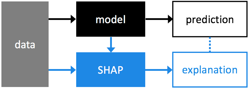

SHAP (SHapley Additive exPlanations) explains the output of any machine learning model using expectations and Shapley values. SHAP unifies aspects of several previous methods [1-7] and represents the only possible consistent and locally accurate additive feature attribution method based on expectations (see SHAP paper for details, and use github issues for questions).
pip install shap
While SHAP values can explain the output of any machine learning model, we have developed a high-speed exact algorithm for ensemble tree methods (Tree SHAP paper). This has been integrated directly into XGBoost and LightGBM (make sure you have the latest checkout of master), and you can use the shap package for visualization in a Jupyter notebook:
import xgboost
import shap

# load JS visualization code to notebook
shap.initjs()

# train XGBoost model
X,y,X_display = shap.datasets.boston()
bst = xgboost.train({"learning_rate": 0.01}, xgboost.DMatrix(X, label=y), 100)

# explain the model's predictions using SHAP values (use pred_contrib in LightGBM)
shap_values = bst.predict(xgboost.DMatrix(X), pred_contribs=True)

# visualize the first prediction's explaination
shap.visualize(shap_values[0,:], X.iloc[0,:])

The above explanation shows features each contributing to push the model output from the base value (the average model output over the training dataset we passed) to the model output. Features pushing the prediction higher are shown in red, those pushing the prediction lower are in blue.
If we take many explanations such as the one shown above, rotate them 90 degrees, and then stack them horizontally, we can see explanations for an entire dataset (in the notebook this plot is interactive):
# visualize the training set predictions
shap.visualize(shap_values, X)

To understand how a single feature effects the output of the model we can plot the SHAP value of that feature vs. the value of the feature for all the examples in a dataset. Since SHAP values represent a feature's responsibility for a change in the model output, the plot below represents the change in predicted house price as RM (the average number of rooms per house in an area) changes. Vertical dispersion at a single value of RM represents interaction effects with other features. To help reveal these interactions dependence_plot automatically selects another feature for coloring. In this case coloring by RAD (index of accessibility to radial highways) highlights that RM has less impact on home price for areas close to radial highways.
# create a SHAP dependence plot to show the effect of a single feature across the whole dataset
shap.dependence_plot(5, shap_values, X)

To get an overview of which features are most important for a model we can plot the SHAP values of every feature for every sample. The plot below sorts features by the sum of SHAP value magnitudes over all samples, and uses SHAP values to show the distribution of the impacts each feature has on the model output. The color represents the feature value (red high, blue low). This reveals for example that a high LSTAT (% lower status of the population) lowers the predicted home price.
# summarize the effects of all the features
shap.summary_plot(shap_values, X)

from shap import KernelExplainer, DenseData, visualize, initjs
from sklearn import datasets,neighbors
from numpy import random, arange

# print the JS visualization code to the notebook
initjs()

# train a k-nearest neighbors classifier on a random subset
iris = datasets.load_iris()
random.seed(2)
inds = arange(len(iris.target))
random.shuffle(inds)
knn = neighbors.KNeighborsClassifier()
knn.fit(iris.data, iris.target == 0)

# use Shap to explain a single prediction
background = DenseData(iris.data[inds[:100],:], iris.feature_names) # name the features
explainer = KernelExplainer(knn.predict, background, nsamples=100)
x = iris.data[inds[102:103],:]
visualize(explainer.explain(x))
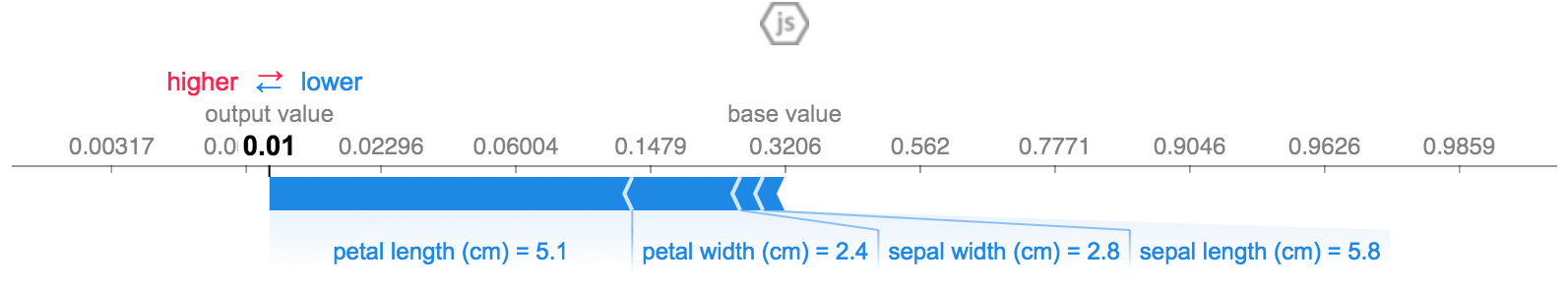
The above explanation shows three features each contributing to push the model output from the base value (the average model output over the training dataset we passed) to zero. If there were any features pushing the class label higher they would be shown in red.
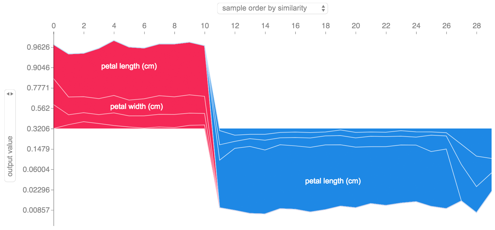
If we take many explanations such as the one shown above, rotate them 90 degrees, and then stack them horizontally, we can see explanations for an entire dataset. This is exactly what we do below for all the examples in the iris test set:
# use Shap to explain all test set predictions
visualize([explainer.explain(iris.data[inds[i:i+1],:]) for i in range(100,len(iris.target))])
The notebooks below demonstrate different use cases for SHAP. Look inside the notebooks directory of the repository if you want to try playing with the original notebooks yourself. Note that the LightGBM and XGBoost examples use the fast and exact Tree SHAP algorithm, the others use the model agnostic Kernel SHAP algorithm.
-
Census income classification with LightGBM - Using the standard adult census income dataset, this notebook trains a gradient boosting tree model with LightGBM and then explains predictions using
shap. -
Census income classification with Keras - Using the standard adult census income dataset, this notebook trains a gradient boosting tree model with Keras and then explains predictions using
shap. -
Census income classification with scikit-learn - Using the standard adult census income dataset, this notebook trains a random forest classifier using scikit-learn and then explains predictions using
shap. -
League of Legends Win Prediction with XGBoost - Using a Kaggle dataset of 180,000 ranked matches from League of Legends we train and explain a gradient boosting tree model with XGBoost to predict if a player will win their match.
-
Iris classification - A basic demonstration using the popular iris species dataset. It explains predictions from six different models in scikit-learn using
shap.
-
Ribeiro, Marco Tulio, Sameer Singh, and Carlos Guestrin. "Why should i trust you?: Explaining the predictions of any classifier." Proceedings of the 22nd ACM SIGKDD International Conference on Knowledge Discovery and Data Mining. ACM, 2016.
-
Štrumbelj, Erik, and Igor Kononenko. "Explaining prediction models and individual predictions with feature contributions." Knowledge and information systems 41.3 (2014): 647-665.
-
Shrikumar, Avanti, Peyton Greenside, and Anshul Kundaje. "Learning important features through propagating activation differences." arXiv preprint arXiv:1704.02685 (2017).
-
Datta, Anupam, Shayak Sen, and Yair Zick. "Algorithmic transparency via quantitative input influence: Theory and experiments with learning systems." Security and Privacy (SP), 2016 IEEE Symposium on. IEEE, 2016.
-
Bach, Sebastian, et al. "On pixel-wise explanations for non-linear classifier decisions by layer-wise relevance propagation." PloS one 10.7 (2015): e0130140.
-
Lipovetsky, Stan, and Michael Conklin. "Analysis of regression in game theory approach." Applied Stochastic Models in Business and Industry 17.4 (2001): 319-330.
-
Saabas, Ando. Interpreting random forests. http://blog.datadive.net/interpreting-random-forests/