 |
|---|
home for the project dedicated to providing insights into black box model explanation, interpretation, and degradation
This is currently a work in progress project aimed at solving the need for model interpretation, explanation, and degradation. I've noticed this to be a pain point in my professional work as well as many others. This project serves as a solution.
The goal is for this package to be model agnostic. Whether you're using Sci-kit Learn, Tensorflow, PyTorch, etc., I want this pacakge to be flexible enough to be used regardless of model type.
This project will be a dockerized web app that, given a model, the data it was trained on, and the data to be evaluated, will provide users with 3 views:
- Explaination: Here you will be able to check why a model made each prediction on a case-by-case level.
- Interpretation: This view will serve as the home for model understanding. The idea is that you will be able to use this page to understand how your model works and what features it is picking up on.
- Degradation: Here you can track how well your model has performed over time. It will provide an interface for whether you should consider retraining your model.
- Clone this repository
- Run
docker-compose build - Run
docker-compose up- This will create the docker container and launch the jupyter notebook instance to develop on.
Currently, I have built out support for numerous interactive visuals all builton https://plot.ly. Some of the visuals can be found below. Most of the visuals you see are representing an XGBoost Classifier trained on the traditional Titanic Data set. If you're not familiar with this data set, it is essentially using Titanic passenger information to predit whether they survived the Titanic or not. [0 = not_survived, 1 = survived]
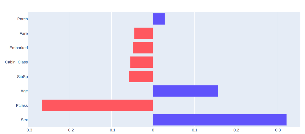
Here is an example of one particular data point from the data set. This shows how important each feature was in this isolated predicted as well as which direction the feature pulled the prediction. Red bars show the feature pulling the prediction closer to zero, and blue bars show the feature pulling the prediction closer to 1
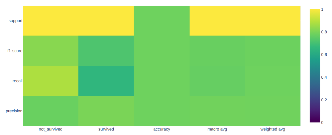
I've also built out support for more traditional visuals like the confusion matrix and classification report. Keep in mind, all of these visuals are interactive, so you will see the values on hovering your mouse over each data point. Though we also have the option to annotate these values as well.
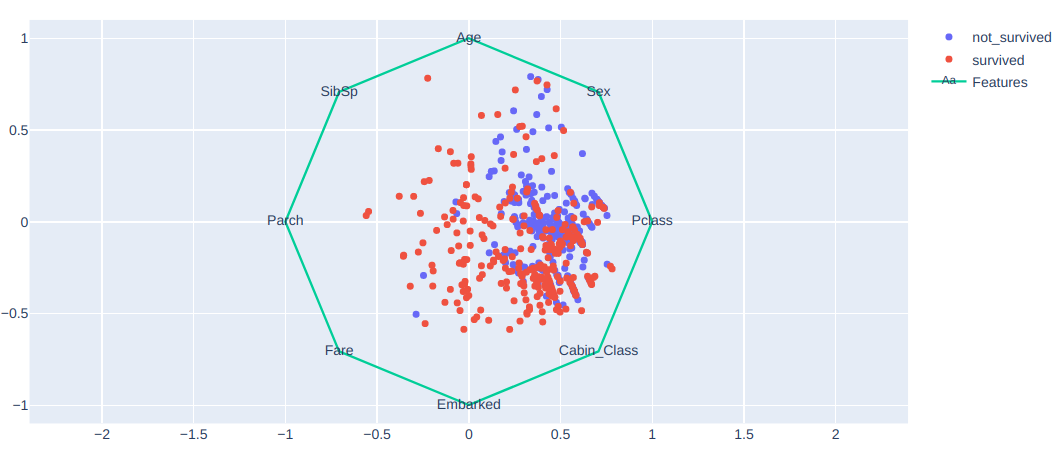
I love this visual for classification tasks. This shows you which features your data tended towards relative to each class.
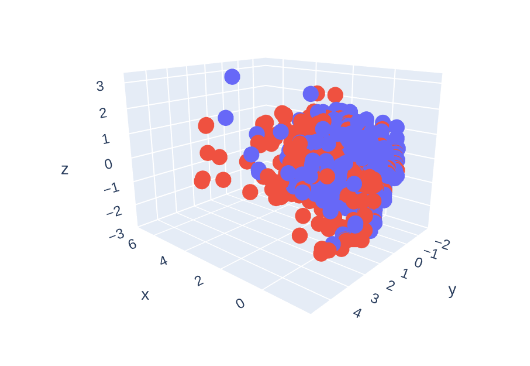
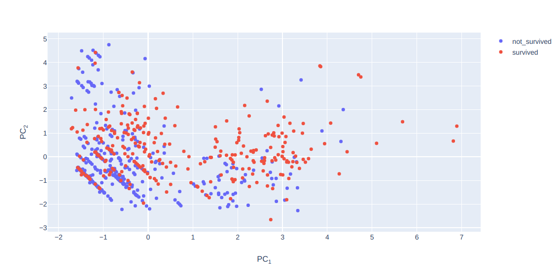 I've added support for both 2D PCA and 3D PCA
- Build out more visuals for regression tasks.
- Abstract these visuals into python classes.
- Build Dash Web app.
- Going to begin by using a MVP Flask app.
- I may need to transition to a Django app for production.
Icon made by Elias Bikbulatov from www.flaticon.com