django-datetime-widget is clean and easy to configure widget for DateTimeField. It based on the famous javascript library bootstrap-datetimepicker.
django-datetime-widget is perfect when you use an DateTimeField on your model where is necessary to have a specific date time format with a clean input.
- Decade year view

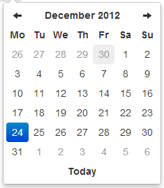
This view allows to select the day in the selected month.
- Year view

This view allows to select the month in the selected year.
- Month view
This view allows to select the year in a range of 10 years.
- Day view

This view allows to select the hour in the selected day.
- Hour view

This view allows to select the preset of minutes in the selected hour. The range of 5 minutes (by default) has been selected to restrict buttons quantity to an acceptable value, but it can be overrided by the <code>minuteStep</code> property.
- Day view - meridian

Meridian is supported in both the day and hour views. To use it, just enable the <code>showMeridian</code> property.
- Hour view - meridian

Install django-datetime-widget using pip. For example:
pip install django-datetime-widget- Add
datetimewidgetto your INSTALLED_APPS.
Create your model-form and set DateTimeWidget widget to your DateTimeField :
from datetimewidget.widgets import DateTimeWidget class yourForm(forms.ModelForm): class Meta: model = yourModel widgets = { 'datetime': DateTimeWidget() }- Download twitter bootstrap to your static file folder.
Add in your form template links to jquery, bootstrap and form.media:
<head>
....
    <script src="https://ajax.googleapis.com/ajax/libs/jquery/1.8.3/jquery.min.js"></script>
    <link href="{{ STATIC_URL }}css/bootstrap.css" rel="stylesheet" type="text/css"/>
    <script src="{{ STATIC_URL }}js/bootstrap.js"></script>
    {{ form.media }}

....
</head>
Optional: you can add option dictionary to DatetimeWidget to customize your input, for example to have date time with meridian:
dateTimeOptions = {
'format': 'dd/mm/yyyy HH:ii P',
'autoclose': 'true',
'showMeridian' : 'true'
}
widgets = {
    'datetime': DateTimeWidget(options = dateTimeOptions)
    }
- format
String. Default: 'dd/mm/yyyy hh:ii'
The date format, combination of P, hh, HH , ii, ss, dd, yy, yyyy.
- P : meridian in upper case ('AM' or 'PM') - according to locale file
- ss : seconds, 2 digits with leading zeros
- ii : minutes, 2 digits with leading zeros
- hh : hour, 2 digits with leading zeros - 24-hour format
- HH : hour, 2 digits with leading zeros - 12-hour format
- dd : day of the month, 2 digits with leading zeros
- yy : two digit representation of a year
- yyyy : full numeric representation of a year, 4 digits
- weekStart
String. Default: '0'
Day of the week start. '0' (Sunday) to '6' (Saturday)
- startDate
Date. Default: Beginning of time
The earliest date that may be selected; all earlier dates will be disabled.
- endDate
Date. Default: End of time
The latest date that may be selected; all later dates will be disabled.
- daysOfWeekDisabled
String. Default: '[]'
Days of the week that should be disabled. Values are 0 (Sunday) to 6 (Saturday). Multiple values should be comma-separated. Example: disable weekends: '[0,6]'.
- autoclose
String. Default: 'false'
Whether or not to close the datetimepicker immediately when a date is selected.
- startView
String. Default: '2'
The view that the datetimepicker should show when it is opened. Accepts values of : * '0' for the hour view * '1' for the day view * '2' for month view (the default) * '3' for the 12-month overview * '4' for the 10-year overview. Useful for date-of-birth datetimepickers.
- minView
String. Default: '0'
The lowest view that the datetimepicker should show.
- maxView
String. Default: '4'
The highest view that the datetimepicker should show.
- todayBtn
String. Default: 'false'
If true , displays a "Today" button at the bottom of the datetimepicker to select the current date. If true, the "Today" button will only move the current date into view.
- todayHighlight
String. Default: 'false'
If true, highlights the current date.
- minuteStep
String. Default: '5'
The increment used to build the hour view. A button is created for each <code>minuteStep</code> minutes.
- pickerPosition
String. Default: 'bottom-right' (other supported value : 'bottom-left')
This option allows to place the picker just under the input field for the component implementation instead of the default position which is at the bottom right of the button.
- showMeridian
String. Default: 'false'
This option will enable meridian views for day and hour views.
- widget for TimeField
- widget for DateField
- widget for DateTime range.
- provide the short/full textual representation of a month with internationalization.
- some more controlls in tranlation of bootstrap-datetime format to python-datetime format.