A simple touch based gui for small instruments. Developed using Python and PyQt. The aim was to have a simple lightweight library for integration with single board computer systems. This code has been tested on Raspberry Pi with a 7 in touchscreen. This has also been tested on desktop computer running Linux or Windows.
The package consists of a group of Python classes for
- Displaying realtime data and measured quantities
- Capturing user inputs through a touchscreen
- Displaying and managing alarms
The screenshot below shows basic buttons and labels. The components and their functionality is described below.
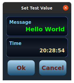
Unlike conventional text labels, the puropose of the text label is to display process parameters. Hence they are designed for display name and value pair. In the image above the name (Message) is shown in the top left. The value (Hello World) is shown right. The text label is defined in ICTextLabel class. A text label can be created by calling its constructor. The class inherits from the QWidget.
lbl = ICTextLabel("Message", "Hello World")
# get the name of the label
print (lbl.name)
# set a new value of the label
lbl.value = str(1.25)The class exposes several properties to get and set displayed values, its apperance and behaviour. The follwoing properties are exposed
| Property | Description |
|---|---|
name |
Name of the parameter displayed on the text label |
value |
Value of the parameter |
name_text_size |
Font size of the displayed name |
name_text_color |
Color of the font used to display the name |
value_text_size |
Font size of the displayed value |
value_text_color |
Color of the font used to display the value |
border_color |
Border color for the widget. This is specified using QtGui.QColor |
back_colors |
A tupple pair of colors (light shade: QtGui.QColor, dark shade: QtGui.QColor). This pair is used to graident render the background of the widget. |
# set new background colors
lbl.back_colors = (QtGui.QColor(200, 200, 200), QtGui.QColor(100, 100, 100)) This is used to display the time. The clock label is defined by ICClockLabel. The class inherits ICTextLabel. The .value property of the ICTextLabel class stores the current time. The displayed time is updated using a timer.
clk_lbl = ICClockLabel("Time")
# get current time.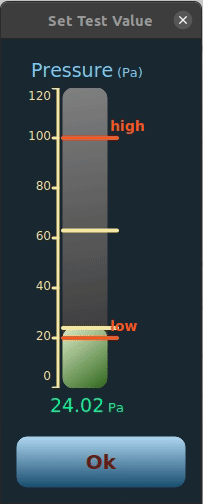
current_time = clk_lbl.time_nowA linear gauge is used to graphically display changing values of parameters. In the animation below, we show its use for tracking pressure. The ICLinearGauge allows definiation of two alarm limits, an upper limit and a lower limit. It also allows tracking of cycle maximum and cycle minimum. This is again a compound widget, which consists of the
- gauge bar defined in the class
ICGaugeBar - a title label at the top, and
- a value label at the bottom
The code below shows creation and manipulation of a linear gauge
# ICLinearGauge(name: str, unit: str, min_val: float, max_val: float, display_steps: int)
# min_val is the minimum value displayed on the bar
# max_val is the maximum value displayed on the bar
gauge = ICLinearGauge("Pressure", "Pa", 0, 120, 6)

# gauge.gauge_bar is of type ICGaugeBar and implements the gauge bar
gauge.gauge_bar.lower_alarm = ("low", 20)
gauge.gauge_bar.upper_alarm = ("high", 100)

# set the value of the gauge bar
gauge.value = 40

# start cycle max and min tracking
gauge.gauge_bar.start_max_tracking()
gauge.gauge_bar.start_min_tracking()The following properties are avaiable from the ICLinearGauge object
| Property | Description |
|---|---|
name |
Specifies the name of the parameter that is is being displayed. |
value |
Current value of the parameter. This is used to draw the gauge bar. This property will automatically update the value in the .gauge_bar. |
unit |
Unit of the parameter being displayed. |
title_size |
Font size for the parameter name displayed at the top. |
title_text_color |
Color of the font used to show the name of the parameter. |
value_size |
Font size for displaying the current value at the bottom. |
value_text_color |
Color of the text for displaying the current value. |
alarm_colors |
A tupple of color pair (background color: QtGui.QColor, text color: QtGui.QColor) to be used to display the value when the current value is not with the specified lower and upper limit. |
unit_size |
Font size of the unit text. |
The ICLinearGauge object initiates a ICGaugeBar object to represent the gauge bar. The following properties are implemented and can be accessed through the .gauge_bar member. The ICGaugeBar object can also be used independently in a GUI.
| Property | Description |
|---|---|
gauge_range_min |
Minimum value to be shown in the gauge bar. |
gauge_range_max |
Maximum value to be shown in the gauge bar. |
gauge_value |
Current value used to determine the level shown by the gauge bar. |
upper_alarm |
A tupple of (name: str, value: float) pair to define the upper alarm level. |
lower_alarm |
A tupple of (name: str, value: float) pair to define the lower alarm level. |
alarm_level_text_size |
Size of the font used to display the alarm level description text. |
alarm_level_text_color |
Color of the font used to render the alarm level text. |
num_steps |
Number of steps in the scale (ruler) of the gauge bar. |
tick_text_size |
Font size of the text used to display the scale (y-axis) text. |
tick_color |
Color of the font used to display the scale (y-axis) text. |
back_colors |
Color pair (light shade: QtGui.QColor, dark shade: QtGui.QColor) used to render the gauge background. |
gauge_color_normal |
Color pair (light shade: QtGui.QColor, dark shade: QtGui.QColor) used to render the gauge bar when the current value is between the specified lower and upper limit. |
gauge_color_alarm |
Color pair (light shade: QtGui.QColor, dark shade: QtGui.QColor) used to render the gauge bar when the current value is outside the specified lower and upper limit (alarm condition). |
Min and max tracking are enabled through fuctions. To track cycle maximum, every cycle the tracking can be reset to restart the tracking.
| Function | Description |
|---|---|
start_max_tracking() |
The gauge bar can track the max level observed. This function needs to be called to enable the max tracking. |
reset_max_tracking() |
This function resets the tracked max value to the current value. |
stop_max_tracking() |
Stop tracking the max level. |
start_min_tracking() |
Start tracing the min level. |
reset_min_tracking() |
Reset the tracked min value to the current value. |
stop_min_tracking() |
Stop tracking the min level. |
A value change event is emitted by this class. changed event passes the current value.
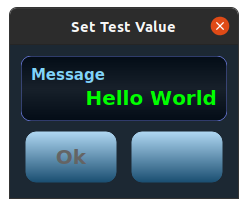
Two basic buttons are shown in the figure above. The ICBaseButton class inherits the QWidget class. The puropse of the class is to capture the click events. The button is created by calling
# constructor ICBaseButton(name: str, button_id: int)
but = ICBaseButton("Ok", 0)The following properties are implemented by the class
| Property | Description |
|---|---|
name |
The name displayed on the button. This is a string datatype. |
button_id |
The id of the button. This is an integer. The id is used to identify in case multiple buttons have the same name. |
clickable |
Defines if the button can be clicked and will emit a clicked signal. This is a boolean property. |
text_size |
Font size of the button name |
text_colors |
Color of the font used to display the button name. A tupple of color pairs is used to set or get the (enabled, disabled) colors. |
button_colors |
Color pair (light shade: QtGui.QColor, dark shade: QtGui.QColor) used to graident render the background of the button. |
state |
The state of the button. The different states of a button are defined in the ICWidgetState Enum. |
The different possible states defined in ICWidgetState are
| State | Description |
|---|---|
VisibleEnabled |
The button is visible and enabled. By default the button is clickable in this state. However this behaviour can be changed by modifying the clickable property. |
VisibleDisabled |
The button is visible but disablyed ("grayed"). By default the button is not clickable in this state. A disabled button is shown in the image below. |
FrameOnly |
Only the frame of the button is visible. The name of the button is not rendered. By default the button is clickable in this state. A frame only button is shown in the image below. |
Transparent |
The button is rendered using the background color. Hence the button is not visible but occupies the space. By default the button is not clickable in this state. |
Hidden |
The button is hidden. By default the button is not clickable in this state. |
On clicking the button emits clicked event. The clicked event has two formats
- If the
.button_idis defined then the raised event passes both.nameand.button_idwith the event - If the
.button_idis not defined then the raised event passes.nameonly
# in the user code the event can be captured by connecting to the event
but.clicked.connect(on_ok_click)

# the function to be called in the case of a button click event
@pyqtSlot(str, int)
def on_ok_click(name: str, id: int):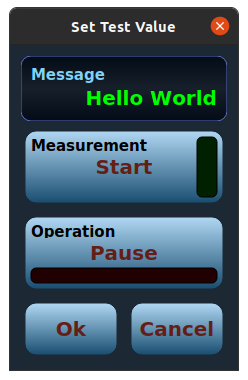
print("button clicked")A toggle button is a state maintaining button. They represent the mechanical swithces. One example is an start-stop switch for any instrument. The toggle button class ICToggleButton inherits the ICBaseButton class. The toggle button shows a label on the top left. It is used to indicate what type of parameter is being toggled. The main text in the centre changes with the state. There is a LED button to distinguish the two states as shown in the images below.

The toggle button can be created by
# ICToggleButton(label: str, off_text: str, on_text: str, init_state: bool, led_type: ICLEDType)
btn = ICToggleButton("Operation", "Pause", "Resume", False, ICLEDType.ToggleNormal)The follwoing properties are available to modify the button behaviour
| Property | Description |
|---|---|
state |
A boolean property to get or set the current state of the toggle button. |
label |
Label displayed on the top left of the button. |
on_off_text |
A string tupple of (on text: str, off text: str) to be displayed in the button. |
led_type |
Used to determine the color of the LED used. This can be used to specify the sevrity level of the toggle button. The different types are specified by the ICLEDType Enum. LED type gives an easy way of switching LED colors. LED colors can be independently changed as described below. Type can be also used for moudlating behaviour. Available types are
|
on_off_led_color |
A tupple specifying color of the led (on state: QtGui.QColor, off state: QtGui.QColor) |
label_text_size |
Font size of the label text. |
label_text_color |
Color of the label displayed on the button. |
led_position |
Position of the LED. It is specified by the ICLEDPosition Enum. LED can be placed at .Top, .Bottom, .Left, and Right. |
The toggle button emits the toggled signal. There are two variants
- If the button id is define then the emitted signal passes
.stateand.button_id - If the button id is not defined then the emitted signal passes the
.stateof the toggle button.
Alarms and error messages are an integral part of any instrument control panel. This widget provides a simple way of showing alarms and error codes. The widget consists of a text which displays the error message with the time at which the alarm was raised. The widget also incorporates a toggle button to acknowledge and silent the alarma as seen in the image below. In the image below, three alarm widgets have been added in the dialog box.
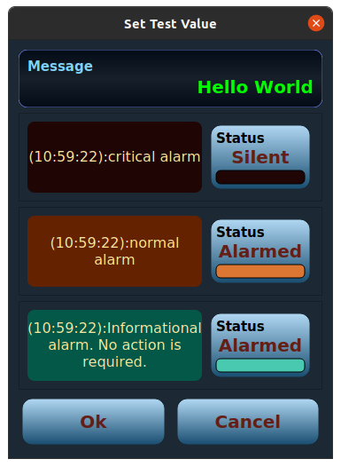
The alarm widget is created in the activated state
# ICAlarmWidget(alarm_id: int, alarm_message: str, alarm_description: str, led_type: ICLEDType)
alrm1 = ICAlarmWidget(0, "critical alarm", "This is a critical alarm.", ICLEDType.AlarmCritical)The widget can be manipulated using the following properties exposed by the class
| Property | Description |
|---|---|
alarm_id |
The id of the alarm. It is an integer. This is not displayed. |
alarm_text |
A short descriptive text that is displayed on the widget. |
alarm_description |
A more descriptive text that helps the user to resolve the problem. This is displayed in a popup dialog that is shown once the user acknowledges the alarm. The popup dialog allows the user to decide if they want to silenece the alarm or leave it in the active state. |
alarm_status |
A readonly property showing the current status of the alarm. The return type is ICAlarmStatus Enum. The possible values are Active, Acknowledged, or Inactive. |
alarm_type |
This is of the ICLEDType. Sets the severity level of the alarm. The color of the alarm and the LED is linked to the alarm severity. Changing the alarm severity changes teh colors. The colors can be changed independently as well. |
raised_time |
Time at which the alarm was raised. This is readonly property. The return type is datetime. |
acknowledged_time |
Time at which the alarm was acknowledged. This is a readonly property. The return type is datetime. |
reactivation_time |
After an alarm is acknowledged it becomes inactive a specified period. The time after which the alarm can be reactivated is given by this parameter. |
message_text_size |
Font size of the message text. |
message_font_color |
Color of the message font. |
message_back_color |
Background color of the message text. |
acknowledge_button |
Toggle button used for acknowledging the alarm. |
The widget emits the acknowledged event, when the alarm is acknowledged by the user. The event passes the alarm id as its parameter.